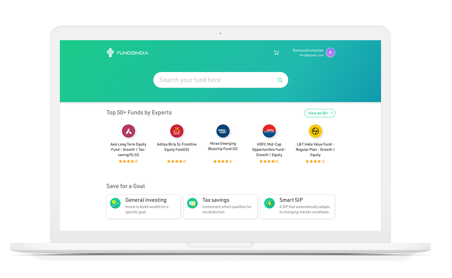
India’s largest and No.1 online investment platform. Trusted by over 1 million customers. It has large investment categories which creates wide way of benefits based on the user needs. Especially with a goal based investment approach gathered large volume of customers.

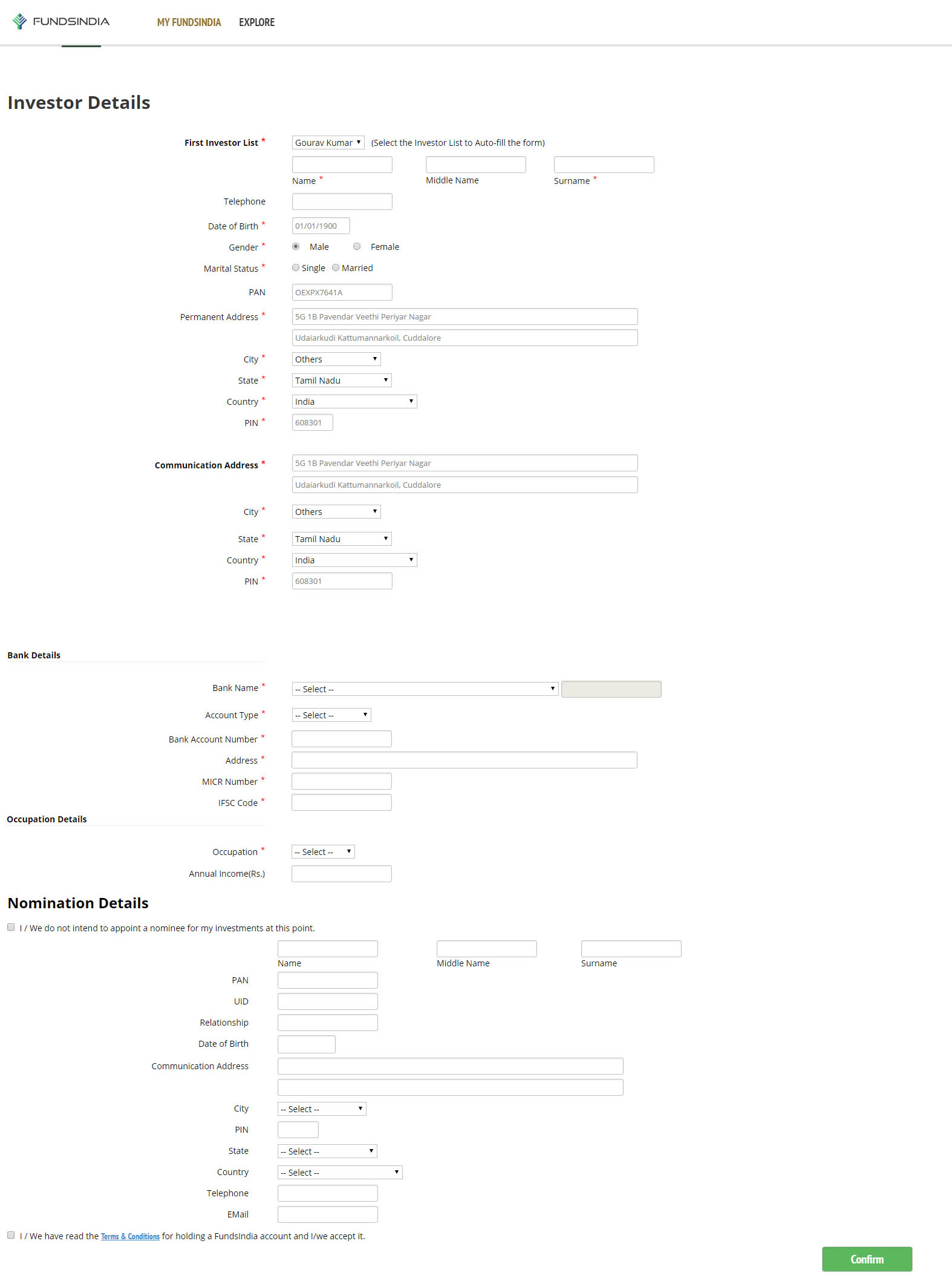
With all the aspiring factors, it has own way for new user to on-board, because the web app remains unchanged from the beginning , where it requires improvements.

To comply with my non-disclosure agreement, I have omitted and obfuscated confidential information in this case study. All information in this case study is my own and does not necessarily reflect the views of Fundsindia.
Role

Research, Information architecture, Interaction, Visual design, & testing

Duration

November 2018- Feb 2019

Research

A very essential phase in research is to collect quantitative and qualitative data, started with stakeholder interviews, lot of unclassified substances are gathered and got into a shape with conversations. The spark-lines from the conversations are
  • Customer onboard efficiency should be increased
  • Providing a smooth and simple investment process

With internal audit started collecting data from previous tickets, call records which provided large volume of data from different perspectives. From on-boarding, customer support and logistics team, started synthesizing the collected data which produced customer needs & pain points.

User Interview from existing and funnel drop-Off users, user surveys through the platform dashboards and google forms, lab test(on-on-one), natural user study all these research outcome pointed the registration process. Few pain points are below.

Empathy Map from user study has given us a way to classify the problem and their type. Provided with few data below.

Says

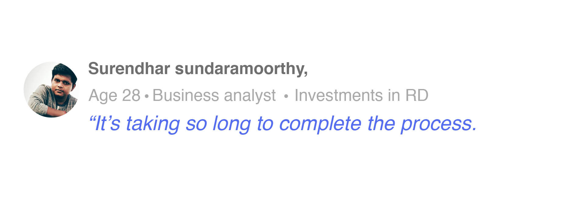
This registration process takes long time

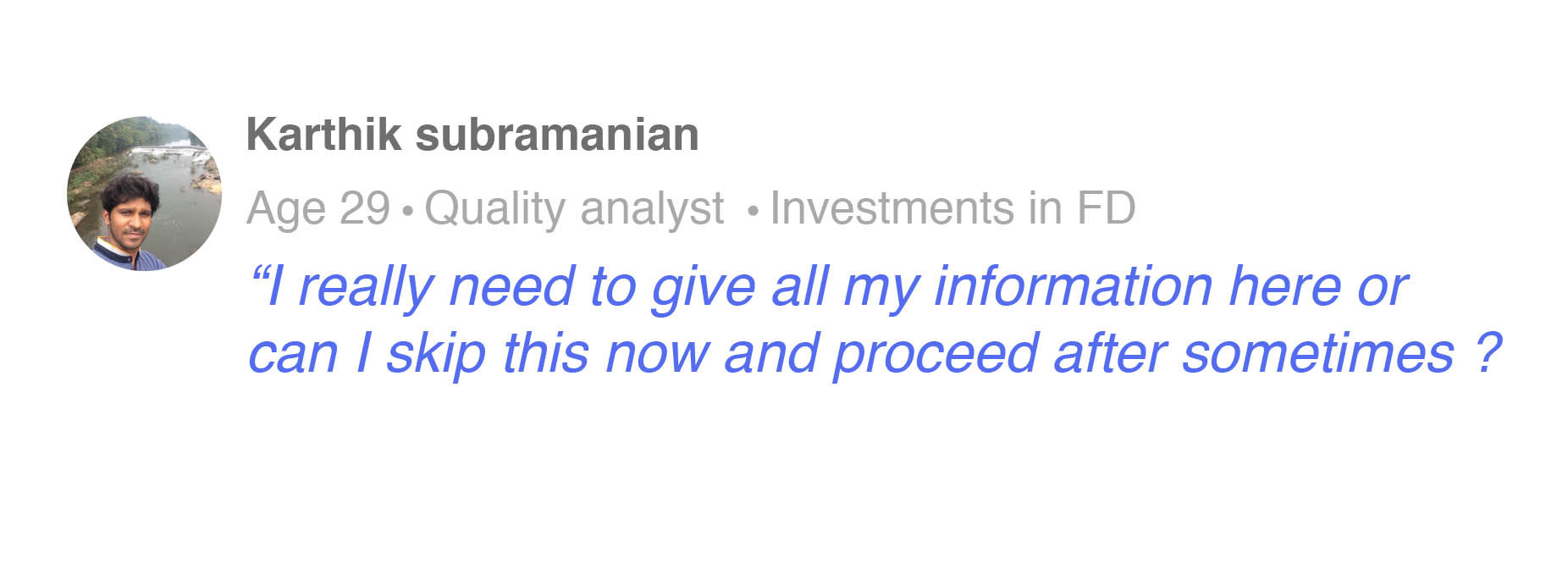
Did I really need to produce all my details

Is there any tax saving funds

Thinks

What should i do now after I reach dashboard

Where can i see the particular fund which I need

There are many informations to lookup in fund property

Feels

There should be something to show about “remaining steps”?

Can platform show me the same step even after I login later

Does

Figuring out the fund details and its advantages

No inputs for optional questions anywhere

Focuses on good performing funds
By creating assessment against the competitors, pointed where are the UX attributes which influence the success of key business objectives. Those are measurements against navigation, performance, features, information hierarchy, context labelling & with heuristic evaluation.

Qualitative & Quantitative data

64.3% of users not completed the registration process(Mar 2017-Mar 2018)

Data during user study
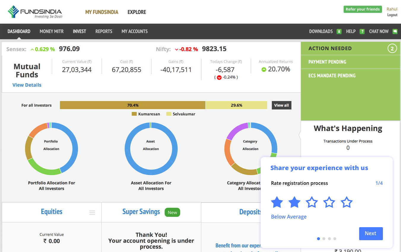
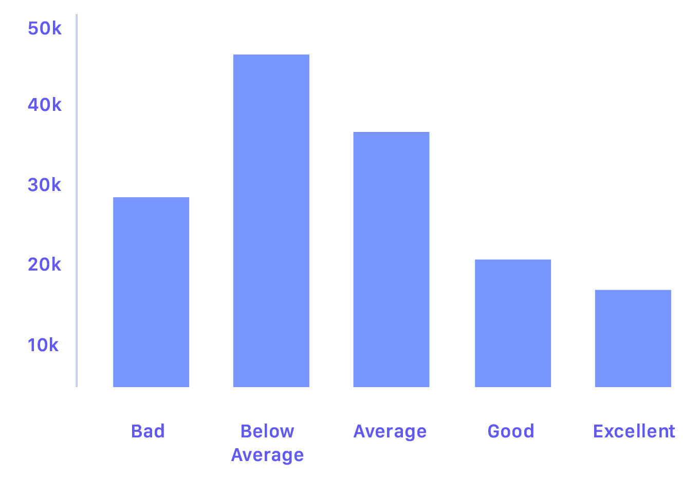
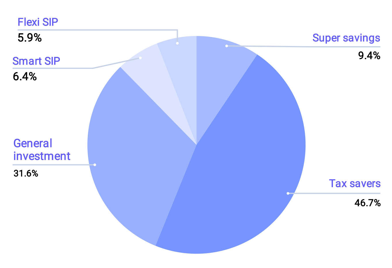
By tossing closed and open ended questions during survey, we discovered important issues to be addressed. Some of the survey results are
Screenshot of survey conducted under the platform(dashboard)
Feedback for registration from survey
Feature utilization from survey
Some of the tickets under category of registration

Data are gathered and synthesized, plotted under value proposition to identify desired state of product(Gain creators pain relievers). Some of them are

  1. Seamless on-boarding experience
  2. Showcase the essential information on fund details
  3. Visibility of the product
  4. Focusing on user needs

Insights

After conducting interviews, contextual inquiry and analyzing the gathered data, collected the below insights

  1. Platform understandability is not clear after registration
  2. Primary actions are not accessible
  3. Investment made without understanding the returns
  4. No clarity in navigation
  5. Low Priority on information

Problem(s)

- Users didn’t complete the registration process due to time consumption. Thereby conversion of investors are deteriorating.

- Ambiguity after the completion of registration, due to poor guidance under the dashboard creates less visibility and clarity of platform and its features.

- Thereby, the goal of the project is to create easy registration for users to make their first investment in a seamless way.
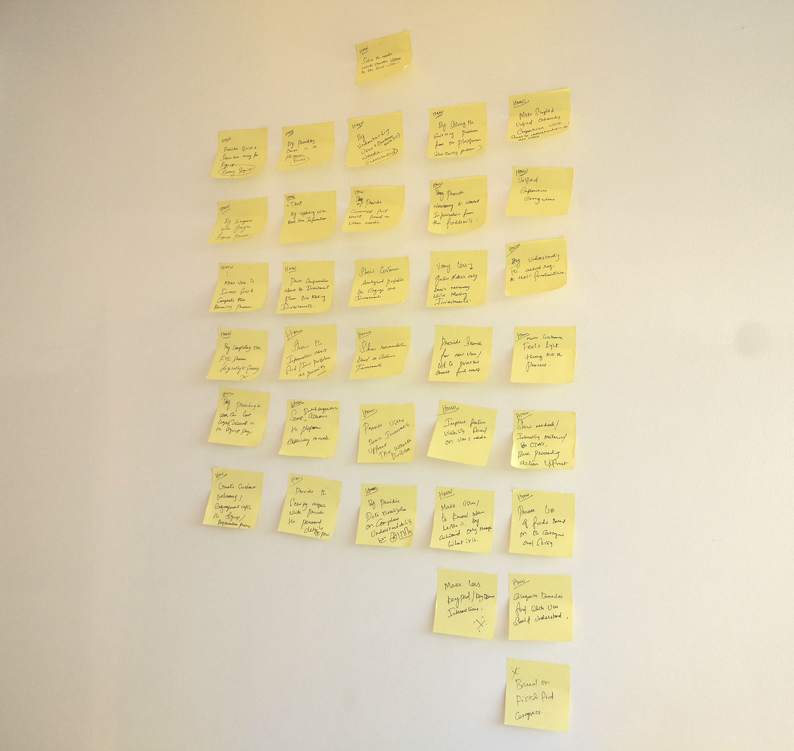
Started ideating with HMWs “How might we solve the needs by providing new opportunities and create value to the end user''. Triggered new opportunities more than a solution and help focus towards the problem statements, from lightning talks collected HMW statements(sticky) those are grouped and categorised under the affinity map along with research data, help to prioritize the things that need to be addressed for further design process.
From HMW statements

Conceptualization

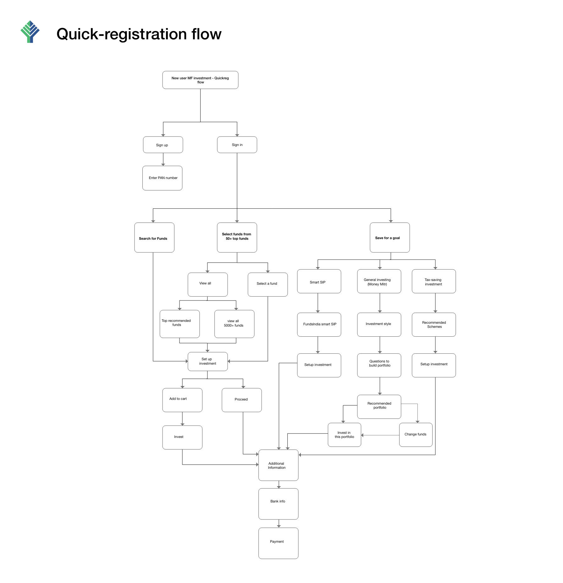
Customer needs are turned into a functional aspects by figuring out the key user journey(golden path) and secondary flows inside the user journey. IA derived in a way which user understands and navigates the platform, which accomplished using card sorting.
By creating a low fi concept for the primary use case with go-ahead approval from PM, Stakeholders and Devs. Started visuals after Ideation phase, it's an iteration process.
User journey

Previous Registration flow

The Solution

With user testing, stakeholder reviews and countless discussions with development team created a solution for the stated problem.

A way to start a meaningful journey

Essential details about the fund

Quick filter categorization

Feature based on user needs

Results

Improved 26% to 69% of users completed registration along with investment

above results from user test

Also for mobile responsive web

Note: With mobile first approach, low-fi are created and refinements are made to keep the consistency and experience for user to perform the action.

Learnings

Less is more

Providing clarity doesn’t mean giving out all the information, It’s about prioritizing with effective measures. From Card sorting, user Interviews and further exercises.

MVP learning curves

Strategic plan to launch an MVP, allows to validate the out-of- scope and accelerates the features quality under project roadmaps.

Freedom for design thinking enhances the value of the product

By Identifying the needs and focusing on goal provided better solution